#webdesign #webdesignlayouts #webdesignadvice
Hello! I’m David Grubb from Shepherd’s Loft, and I’m here to help you design a better website. In this post, I want to share three key reasons why it’s important to update your web design layouts. Whether you’re a small business owner or a seasoned marketer, a well-designed website can make all the difference in how you communicate with your audience and how well your content performs. Let’s dive in!
1. Improved Readability
The first reason to update your web design layout is readability. Making your website content easier to read not only improves the user experience but also encourages visitors to stay longer on your site. Here are some simple things to consider:
- Break up large blocks of text: Instead of long paragraphs, break content into smaller, digestible chunks. This makes it more scannable and less overwhelming for your visitors.
- Add images or videos: Visual elements like images and videos can complement your text and make the page more engaging. Plus, they help break up the monotony of large blocks of text.
- Whitespace is your friend: Adequate spacing between sections, text, and images ensures the page doesn’t feel cramped and helps the eyes naturally flow from one section to the next.
A readable design keeps visitors engaged, and it also makes them more likely to consume your content—whether that’s reading blog posts, watching videos, or checking out your services.
2. Better Communication
Next up is better communication. Clear, concise, and well-organized content is essential for conveying your message effectively. If your website layout makes it hard to find key information or if the design feels cluttered, your message may get lost. Here’s how to enhance communication:
- Clarify your call to action: Make buttons, links, and forms stand out so visitors know exactly what to do next. Whether it’s scheduling a consultation, signing up for a newsletter, or making a purchase, a clear call to action is crucial.
- Logical flow of content: Organize content in a way that tells a story. This could mean placing your most important information at the top of the page, using headings and subheadings to guide the reader, or adding sections like “Testimonials” or “FAQs” where visitors might have questions.
- Reduce distractions: Too many pop-ups, ads, or sidebars can distract visitors from your main message. A clean layout with fewer distractions allows the message to shine through.
A well-designed layout allows you to communicate more effectively, keeping the focus on what matters most—your message.
3. Enhanced Search Engine Optimization (SEO)
Last but certainly not least, an updated web design layout can improve your Search Engine Optimization (SEO). Yes, the structure and design of your website impact how well it ranks on search engines like Google. Here’s how:
- Readable text improves SEO: Shorter sentences and well-structured paragraphs are easier for search engines to crawl and index. Google rewards content that is user-friendly and easy to digest.
- Add multimedia content: Text is important, but adding images, videos, and infographics can increase the time users spend on your page, which is a positive ranking signal for Google. Plus, multimedia elements can be optimized with alt text and descriptions to improve SEO.
- Better organization: A clean, well-organized layout helps search engines understand the hierarchy of your content. Using proper heading tags (H1, H2, etc.), including keywords naturally in your text, and ensuring a logical page structure will help search engines rank your content higher.
Ultimately, by improving readability and communication, you’re also creating a website that works better for both users and search engines. This can lead to better rankings, increased organic traffic, and a higher return on investment for your website.
Let’s Take a Look at Some Real-Life Examples
Now that we’ve covered the theory, let’s look at some real-life examples of how updating a website layout can dramatically improve the user experience, readability, and SEO.

Example 1: Homepage Overhaul
Before:
The original homepage had a huge block of text under the “1999” date, making it hard to read. The sidebar on the right was filled with useful information, but it distracted from the main content. There was also a lot of empty space that felt unintentional and messy.
After:
We removed the sidebar, focusing on the main content in the center of the page. The text was broken up into three smaller paragraphs, and a picture was added to make it more visually appealing. A subtle background color change helped separate the content from other sections, and now the layout feels cleaner and more organized. The result? Better readability and an enhanced focus on the content that matters.

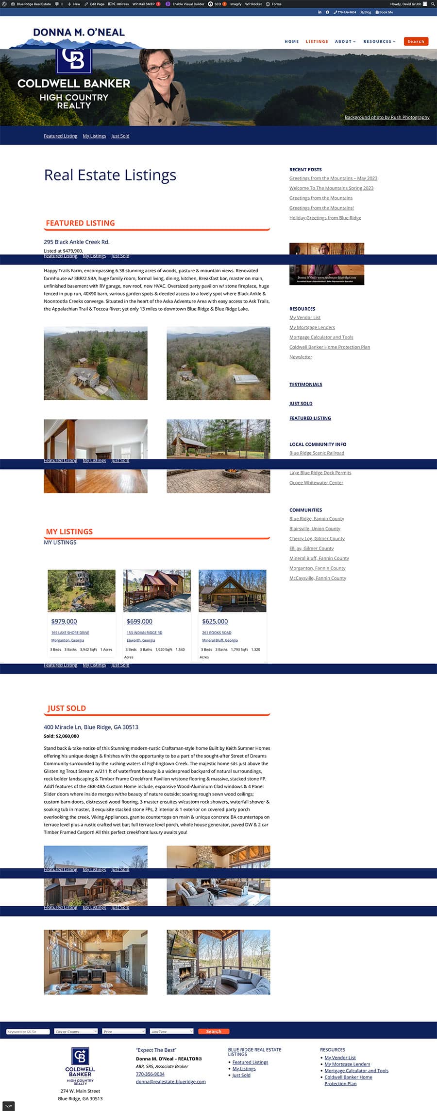
Example 2: Listings Page Redesign
Before:
The listings page was filled with large paragraphs and a sidebar that made it harder to focus on the property details. The text was difficult to read because of the blocky layout.After:
We broke the content into two columns, making it easier to read. The sidebar was removed to reduce distractions. The new layout looks more polished and is easier for visitors to scan and digest. We also added images of the properties to make the page more engaging, which is great for SEO.

Example 3: Community Information Page
Before:
The original community information page had a mix of video and long blocks of text that stretched across the page. It was hard to read and felt a bit overwhelming.After:
We reorganized the content into two columns, added images to break up the text, and introduced a clear structure that guides visitors through the page. The videos were stacked into two columns, and we added a “local info” box to highlight key information. This not only made the content more readable but also improved the page’s SEO by adding relevant images and multimedia content.

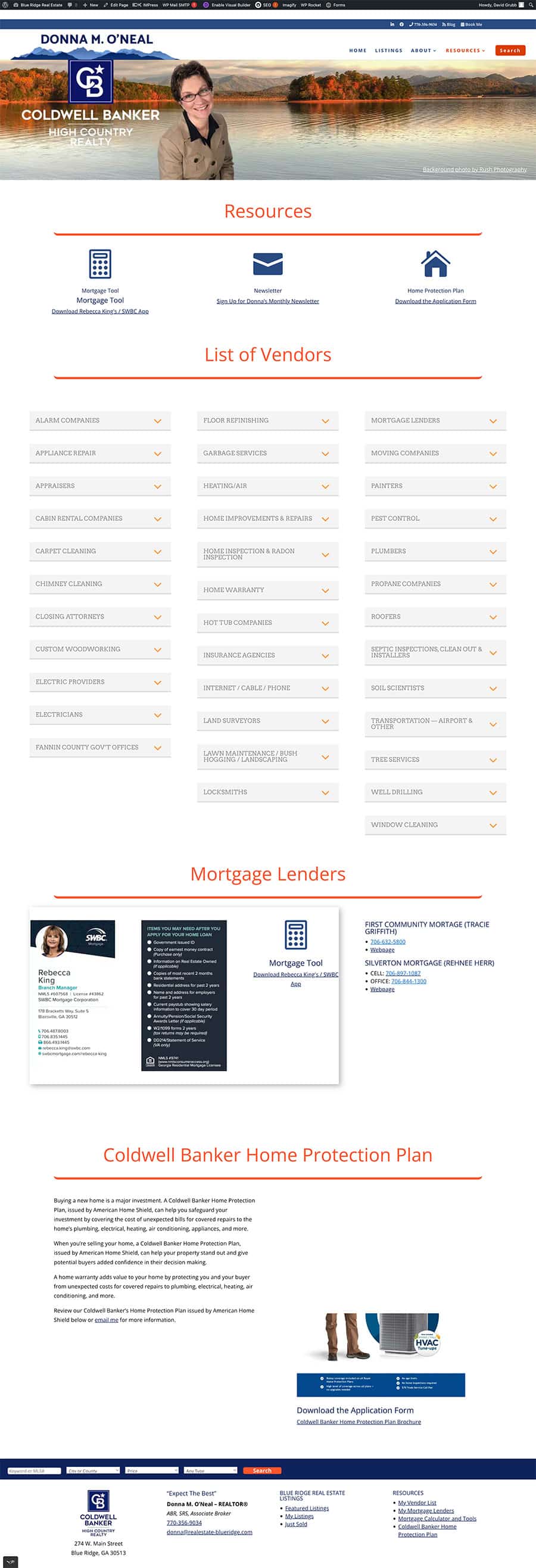
Example 4: Resource Page Update
Before:
The resource page had a cluttered layout with inconsistent elements, making it hard to navigate. There was no clear call to action, and the design felt outdated.
After:
We added a sticky navigation bar, consistent blue accents across the page, and reorganized the content into more readable columns. A new download button made it easier for users to access resources. These simple updates improved both the layout and the page’s overall functionality.
Web Design Layouts Conclusion
Updating your web design layout isn’t just about making your site look better—it’s about improving readability, communication, and SEO. By making these updates, you ensure that your content is more accessible, user-friendly, and optimized for search engines. The result is a website that not only looks great but also performs better.
If you’re ready to give your website a makeover or need help with your web design, don’t hesitate to reach out. I’d love to help you create a website that stands out and delivers results!
Review the Web Design Project https://shepherdsloft.com/project/real-estate-blue-ridge-web-design/
