Introduction
#images #webdesign #websiteimages
They say a picture is worth a thousand words, and this holds true on the internet as well as in our daily lives. Website images have been a mainstay of website design since it was first possible to upload them onto the World Wide Web. As a business or organization with a web front, it is important to utilize this visual media effectively on your website. Incorporating high-quality images into your website can help improve readability and further entice your viewers to your content and brand.
Whether you are using real-life photographs or digitally designed icons and logos, the proper usage of images in web design is crucial for making an appealing and reputable website. There are numerous reasons why this is the case, and hopefully, these pointers will help you understand how to better use website images to your advantage.
- Visual media captures reader’s attention
- More Modern, Professional Design
- Showcase Your Content and Story
- Website Images are one of the essential elements

Visual Media Captures Reader’s Attention
First and foremost, pictures attract attention. Website images stand out more to the human eye than plain text does; in fact, the human brain processes images and other visual information 60,000 times faster than text (Eisenberg, 2014). While it is true that not all pages necessarily need images on them to serve their purpose, most websites can benefit greatly from well-placed images to catch the reader’s attention and help communicate information about the page.
This is especially true for the landing page of a website, as this is where users will get their first impression of your website. It is important to entice the viewers to your website as soon as they arrive so that they will read what you have to say and then possibly follow through with a call to action. Many websites’ landing pages will utilize a carousel, or slideshow, element that cycles through multiple website images with informative captions, providing a quick overview of what the given website is about.

Website Images Make Text Easier to Read
Website images are not just great at catching a user’s eyes and communicating ideas quicker than plain text; images can also help make the text much more readable. One of the biggest sins of web design is creating the dreaded “wall o’ text.” Long stretches of words oftentimes make the text more difficult to read and cause the audience to lose interest, especially on landing pages.
Even if you properly format text with headings and separated sections, it is best to reserve having a lot of text and no images for pages that are meant to serve as detailed documentation rather than your standard webpage. Including even just a few images in sections with text helps space out the writing and make it easier for the viewer to follow along with the flow of text. As discussed, images are often the first things people see when viewing a webpage, so they work exceedingly well as a guide for readers navigating through your webpage.

More Modern, Professional Design
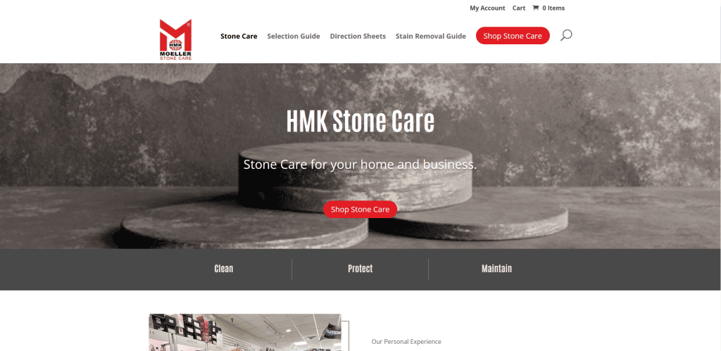
Like all aspects of web design, website images also play a role in how credible you, your business, or your organization is to those who view your website. A website with no images whatsoever will likely look primitive and unprofessional. However, just having images is a fairly low bar. One critical aspect of images in web design is that they must be high-quality and professional. A customer viewing the website for a business and seeing a series of low-quality graphics and photographs may dismiss the business altogether, given how much a website can leave a good or bad impression of a business.
For a company looking to have a professional web front, it is important to work alongside graphic designers regarding the visual media for their website. Photographs need to be done with a high-quality camera, and in some cases, it might be best to hire a professional photographer. Logos and other iconography are also important for having a slick design; even websites with zero photographs have some sort of graphic design element to them, even if it is just a logo.
And regardless of how high-quality your website images are, you need to make sure that they are implemented onto your website as the proper file types. Using the wrong file type can result in images appearing stretched and potentially looking worse on different screen sizes, such as a PC screen versus an iPhone. [Mozilla has an image file type and format guide to give you an idea of what file types are good for specific scenarios in web design (https://developer.mozilla.org/en-US/docs/Web/Media/Formats/Image_types)]

Showcase Your Content and Story
Lastly, website images are a fantastic way of telling your story, whether that is for your organization, your business, or whatever other purpose you have published your website for. In the case of a business website, there are four main points that need to be communicated to the user: who and what the business is, what the business does, why the user should trust this business, and how the user can access the business’s products and services. The first three points here all tie into the company story that a website is supposed to convey to its viewers to answer these questions.
There’s also the aspect of branding. Strong graphic design that incorporates logos and other iconography representative of your brand helps make people not only notice your organization or business but also remember who you are. Web and graphic design for a company should be approached the same as any other form of marketing. Creating a well-designed website that stands out and brands itself effectively will make your company more recognizable as well as make you appear more trustworthy.
Consider taking photographs of your business and what it does. If your website is for a company that provides some product or service, show pictures of your products and the results of your services. This also applies to non-profit organizations or any other group that serves some purpose. Your images should help showcase who you are, what you do, and why people should care about or rely on you. Alongside this, consider working on an overall, consistent design for your website and logo that makes your brand stand out among others on the internet.
Images are one of the essential elements
The main takeaway here should be that images are one of the essential building blocks for creating a website, especially for an organization or business. Images can catch the reader’s eye and quickly communicate information, especially when paired with small sections of text and captions. When used correctly, visual media like photographs and other graphics can make your webpages flow better, give your website a more professional look, and showcase to your audience what your company is about.
When working with a web designer on a website for your business, organization, or other purpose, you should consider what images you would like to include on your website, along with a general idea of how you want your site’s visual design to look.
A good web designer can help you with this design process and give recommendations, but ultimately, it is your story that needs to be told. Regardless of what your purpose is, visuals in web design are powerful tools that you should always be utilizing when you have something to say.
Sources:
Eisenberg, H. (2014, September 15). Humans process visual data better. Thermopylae Sciences + Technology. https://www.t-sciences.com/news/humans-process-visual-data-better
