Logo Design Ellijay
A logo is the anchor for your brand, determining the design/look & feel of all your marketing materials and online presence.
What Is A Logo?
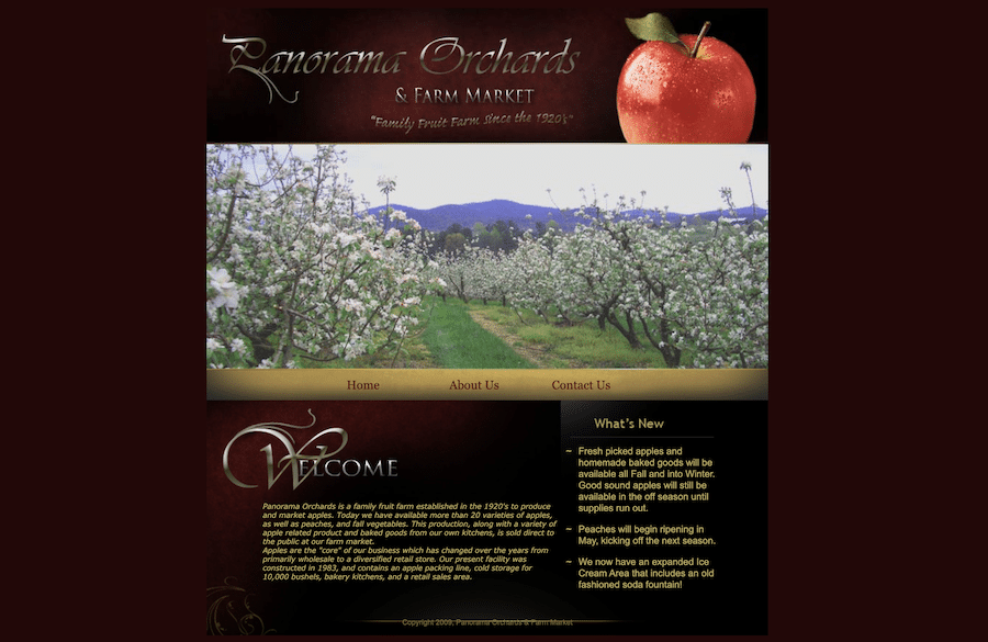
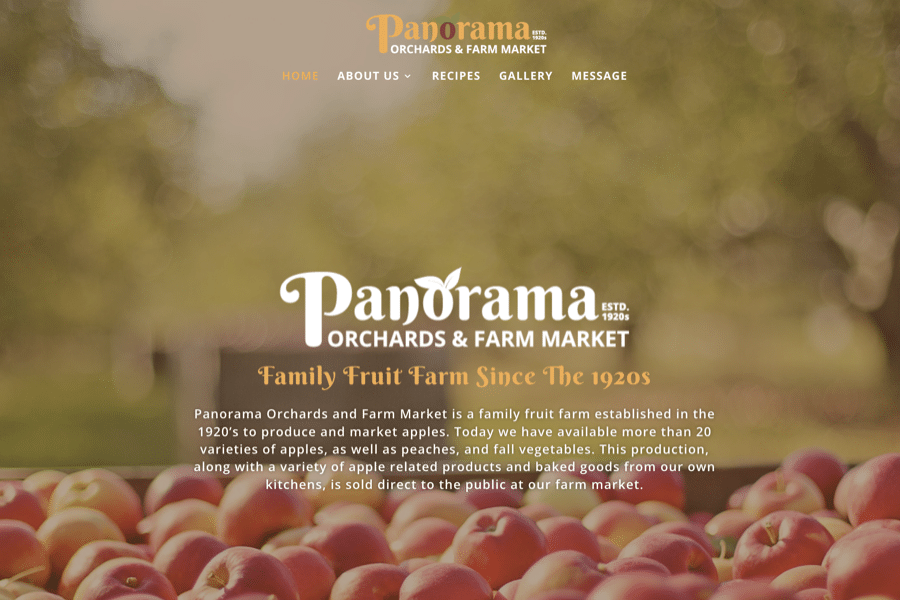
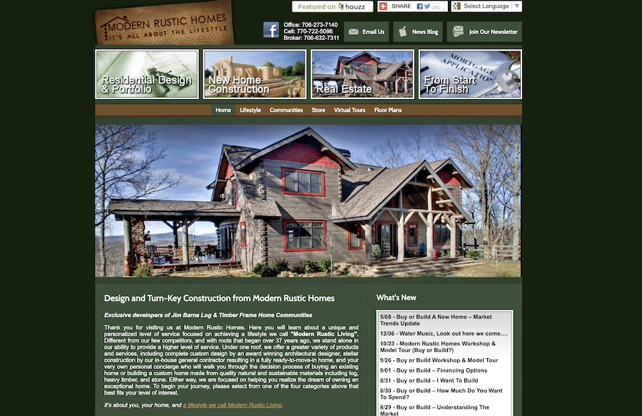
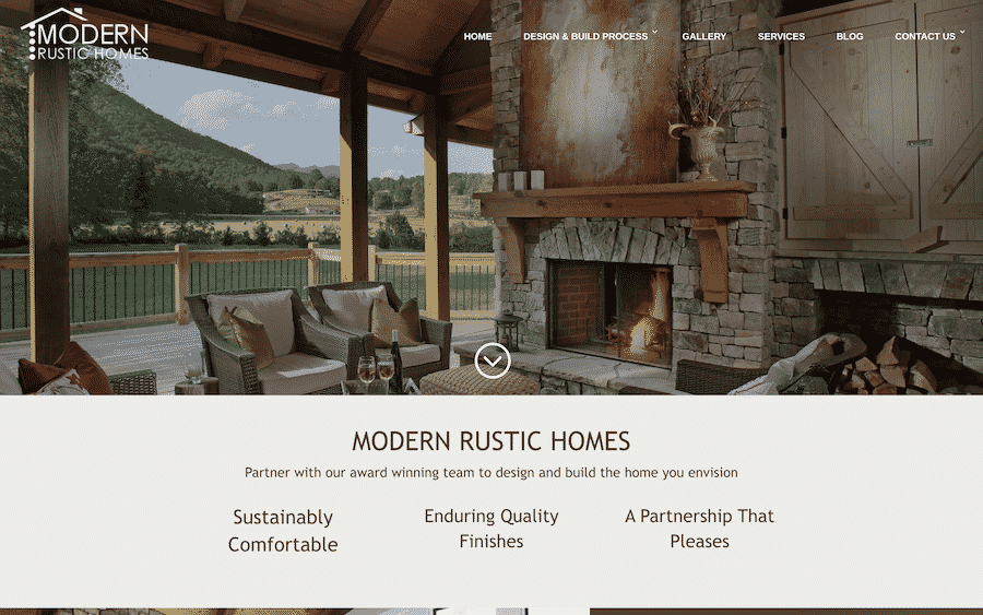
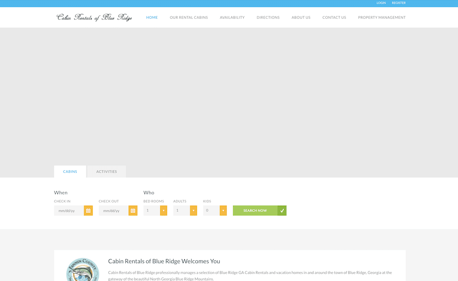
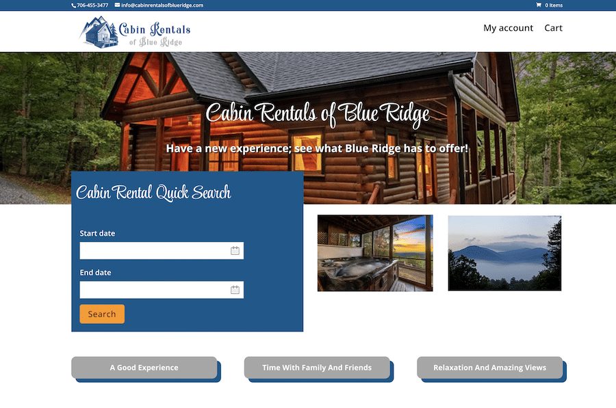
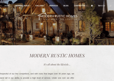
A logo is simply a graphic representation of your business. See logo design examples below.
of first impressions of a brand come from their logo alone

Symbol
A graphic symbol or icon to represent your brand, often used on products and social media profiles.

Logo Name
Your company name written out in the preferred font and color.

Combination Mark
The company symbol and name combined together.
Logo Design Enhancements
New Logo Designs



Logo Design Projects
A collection of logo design projects made with WordPress. Below you will find our web design Portfolio, customer videos and reviews.
Commonly Asked Questions About Logo Design
What makes a good logo?
A good logo design is memorable, versatile, relevant, simple, and timeless. It should clearly convey the brand’s identity and values.
How do I choose the right colors for my logo?
What is the difference between a logo, a logotype, and a logomark?
How important is typography in logo design?
Should a logo be designed in color or black and white first?
How do I know if my logo is working?
A successful logo design should be easily recognizable, versatile across different media, and resonate with the target audience. Feedback from users and performance metrics can help gauge its effectiveness.
What file formats should I receive for my logo?
How many revisions are typically included in a logo design project?
How long does the logo design process take?
What is brand consistency and why is it important for a logo?
Can I design my own logo, or should I hire a professional?
What are some common mistakes to avoid in logo design?
Web Design Blog
The Glue of the Internet: DNS, Domains, and Digital Security
Master the essentials of DNS, SPF records, and email security with insights from Shepherds Loft and MBT Pro IT experts.
Master Video Production With This Heartfelt Success Story From Tracy Misner
Learn how Tracy Misner turned video expertise into business success with essential tips on cash flow, clients, and mobile video production.
The Value of a Domain Name: Insights from the Experts
Learn how to master domain ownership, boost SEO with aged domains, and secure your brand in this expert interview guide.


